
Service Logo
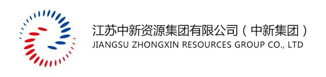
Definition of Identification:
1. The logo logo pattern is composed of vivid colors and curves to form the first letter fancy shape (Z, X) of the pinyin of "Zhongxin". The pattern shape is soft, continuous, and rhythmic; The logo is composed of red and blue colors, with red symbolizing passion, vitality, positivity, and unity; Blue symbolizes rationality, inclusiveness, harmony, stability, leading technology, long-term vision, inclusiveness, courage to take responsibility, and harmonious development.
2. The two interactive red and blue curved lines are each composed of 18 small elliptical points arranged, and the two lines extend outward in an arc shape from their respective origins, interacting with each other. You have me, and I have you, symbolizing that the relationship between the company and customers is interdependent and closely linked, appearing concise, clear, and dynamic. Two curved lines extend infinitely in all directions, like open arms, conveying confidence and enthusiasm, symbolizing broad mindedness, open consciousness, long-term vision, and heroic momentum, implying that everything is connected in all directions, embodying the corporate philosophy of "only by stepping onto the track of international standards can there be infinite extension space".
3. The logo is also like the graphic that keeps running when the web page is loaded and the program is started in the Internet era. It is very dynamic and dynamic, and symbolizes the enterprise spirit of exploration, creative practice and pursuit of excellence.